Images only: slider
For each content element you can (optionally) set a heading and (optionally) link and change the layout; the following examples show the layout "default", "white teaser" and "FAQ".
This image setting is suitable for:
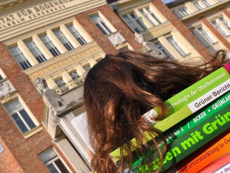
- mood pictures, impressions of projects, excursions, events
- large-format images
- Note: You can use this setting as you wish on a content page and, if necessary, also for smaller images; example at the end of this page.
Options per image:
- title, subtitle, link: are shown in the picture
- image cropping: any image can be cropped
images only: silder – default
-
")
-

field description: subtitle
images only: silder – FAQ
Example of a slider within a content page
The example below shows a 2-column grid element: ratio 1:2; left: text element; right: slider element: Text element; right: Slider element
Image options: the input of title, subtitle and link per image is optional; the images could be cropped directly in the element so that they all have the same size, for example.

")