Colour world


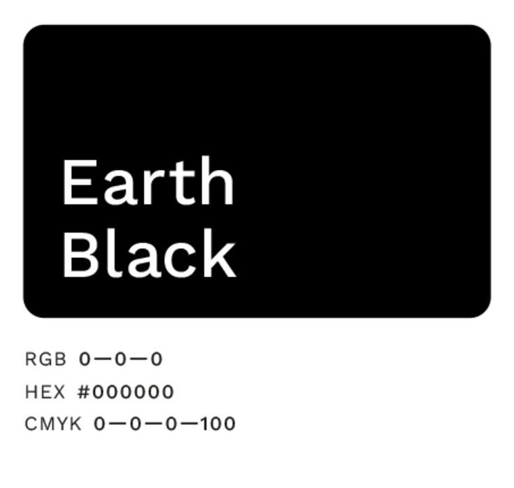
Primary colours: Cool Green and Earth Black

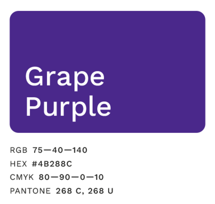
Secondary colours: Grape Purple and Apricot Orange

Diversity for the design spectrum of our BOKU University brand – two complementary colours
Use of complementary colours – always full-surface and for large text, never for continuous text
Equivalent complementary colours – no assignment to specific themes or areas, alternating use in different colour variants possible
Gradations

Further information for BOKU employees and students
Please log in with your BOKUonline access data.