Logo
Main logo
BOKU University
Word-image brand: BOKU University
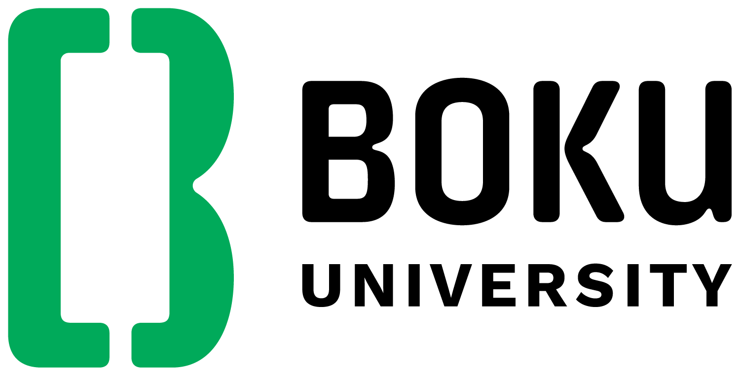
The new word-image brand conveys the new brand name of BOKU University.
The name BOKU – originally the acronym of the first letters of "Bodenkultur" - will be used as an independent name in future. The addition of "University" in English conveys the increasing internationality of BOKU. The new brand name "BOKU University" is short, memorable and easy to remember.
A striking B symbol in green forms the basis of the new logo. The name "BOKU" was designed with a specially developed font and gives the logo a unique look. The addition "University" is also in black.
Important note: The B symbol alone is not the logo. The new logo is always a combination of the B symbol and the BOKU lettering.
Logo variations?
For further logo variations, please send an e-mail to design(at)boku.ac.at.
Further information for BOKU employees and students
Please log in with your BOKUonline access data.
Department- und Institutslogos
The new design includes two department logo variants: Department and institute logos.
If these are used, ‘University’ is omitted and the respective department name is used.